They say a picture is worth a thousand words, and sometimes a chart can make your point more effectively than the raw data behind it can. This is especially true when comparing relative values such as monthly revenue data or team statistics.
In our last episode, we looked at how to define titles in existing Excel charts. Sticking with the Excel Charts theme, let's now investigate how to create new charts in Excel.
A chart is a visualization of data, and for this example, the data represents Runs Scored and Runs Allowed for American League Baseball teams, as reported on the mlb.com website. Our Excel worksheet contains a row for each team, with columns for Runs Scored and Runs Allowed:

We'll use the win32ole library for automating Excel, and we'll connect to a running instance of Excel and use the already open 'mlb_stats.xls' workbook:
require 'win32ole'
xl = WIN32OLE.connect('Excel.Application')
wb = xl.Workbooks('mlb_stats.xls')
Let's define some parameter variables that we'll use later:
xlColumns = 2
xlColumnClustered = 51
xlWhite = 2
xlRed = 3
xlBlue = 5
xlGray = 15
To add a new Chart object to the workbook's Charts collection, call the
Charts.Add method:
mychart = wb.Charts.Add
mychart.Name = "MLB Scoring"
The
Charts.Add method returns a reference to the newly-created Chart object, which we've assigned to the variable
mychart.
To delete an existing Chart object, call the Charts(
chart).Delete method, where
chart is the name or (1-based) index of the chart to delete:
wb.Charts("MLB Scoring").Delete
wb.Charts(1).Delete
Naturally, we can't produce a chart without data, and we use the
SetSourceData method to define the source of the data that the chart will represent. This method takes 2 arguments, [1] a range of cells from a worksheet, and [2] a number that indicates whether to plot the graph by rows (1) or by columns (2):
mychart.SetSourceData wb.Worksheets("Runs Scored and Allowed").Range("A1:C15"), xlColumns
There are many different types of charts to choose from, and for our purpose, we'll use a 2-dimensional column [aka vertical bars] chart, setting the
ChartType property to 51 (via our previously-defined xlColumnClustered variable):
mychart.ChartType = xlColumnClustered
Now, you could execute your code at this point and create a new chart. But let's tweak the colors a bit. The SeriesCollection object holds each series of data and its related properties. Our chart has 2 series, one for Runs Scored, and one for Runs Allowed. Let's make the Runs Scored columns blue and the Runs Allowed columns red, via the
Interior.ColorIndex property:
mychart.SeriesCollection(1).Interior.ColorIndex = xlBlue
mychart.SeriesCollection(2).Interior.ColorIndex = xlRed
We could also dictate the name that is displayed for each series in the legend:
mychart.SeriesCollection(1).Name = "Runs Scored"
mychart.SeriesCollection(2).Name = "Runs Allowed  "
If you do not define a name for each series, Excel will try to pull it from your source data worksheet.
The PlotArea represents the area on which the data (columns, in our case) is plotted. The ChartArea is the area surrounding the PlotArea, on which the title, axes, and legend are placed. For demonstration purposes, let's define specific colors for these objects by setting their
Interior.ColorIndex property:
mychart.ChartArea.Interior.ColorIndex = xlWhite
mychart.ChartArea.Border.ColorIndex = xlBlue
mychart.PlotArea.Interior.ColorIndex = xlGray
mychart.PlotArea.Border.ColorIndex = xlWhite
Finally, we'll add a title to the top of the chart, and format the text:
mychart.HasTitle = true
mychart.ChartTitle.Characters.Text = "American League - Runs Scored vs. Runs Allowed"
mychart.ChartTitle.Font.Name = 'Verdana'
mychart.ChartTitle.Font.Size = 16
mychart.ChartTitle.Font.Bold = true
Note that we first have to set the
HasTitle property to true. Without first doing this, trying to define the various
ChartTitle properties will raise an error.
Our complete code looks like
this, and produces a chart that looks like this:
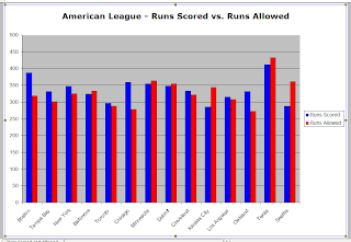
Not a bad start, eh? A quick glance at this chart tells you that Boston and Chicago are doing very well, run-wise, and that it could be a very long season for Kansas City and Seattle. And we see that Texas scores a tremendous amount of runs, but allows even more.
I encourage you to investigate the vast array of chart methods and properties. Towards that end, you might want to check out
Jon Peltier's Chart tutorials, which I have found to be helpful.
Questions? Comments? Suggestions? Post a comment here or send me an email.
Thanks for stopping by!


